Inquiry Question
How can I use digital design tools to create a semester-long zine that captures the genuine authenticity of a physical scrapbook?

Image Credit: Digitally Designed on Canva.
Week One – Beginning Stages of Digital Scrapbook / Hybrid Zine

Image Credit: Digitally Designed on Canva.
Paper → Digital
I’ve missed having the time and opportunity to actually sit down and scrapbook in my journal, but I realized how often I use my laptop, so I thought it would be a good idea to connect the two. Therefore, my goal for this semester-long inquiry is to explore whether I can turn my passion for scrapbooking as a hobby into a digital hybrid zine. Instead of using my usual physical journals, I want to explore digital tools to document my life throughout this semester. I’m challenging myself to do more than just put photos on a page; I want to learn how to use technology to replicate a tangible scrapbook without it looking cold or overly “templated,” and I want to improve on my own digital creative skills, which are pretty minimal, in order to do so.

Image Credit: Digitally Designed on Canva.
My Goal
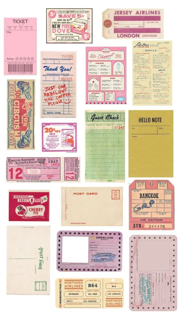
My focus and goal of this week was to build on the foundation of the beginning stages of my inquiry project, so I spent time looking through my favourite physical scrapbooks to find which specific elements I like, why I like them, and what I want to try and create and/or replicate digitally. I found that I really like overlapping textures and “ephemera”, like scattered doodles, handwritten notes, receipts, stickers, labels, and other things I collect in and throughout my daily life. I also prefer dynamic, not overly structured, messy, authentic, non-linear layouts, which I think brings in more of a human quality, as do handwritten notes and lettering over digital fonts. All of these things stood out to me, and I took notes on them for my digital zine.
Image Credit: Digitally Designed on Canva.
Learning Progress
This week, I would describe my first “failure” as a creative one. I tried to create a digital page using basic simple layout tools, but the result was way too structured and neat. Everything felt too digital and corporate to me, which is the opposite of the creative “messy” authenticity I’m aiming for. I realized that my digital literacy is currently at a point where I am reliant on templates. So I’d say that my first challenge is to unlearn the rigid mentality of digital design in order to allow for my own creativity.

Image Credit: Digitally Designed on Canva.
To move past this, I have started looking into more open resources and design software that allow for more freedom.
- Canva for Education: I’m using this to explore their “frames” and “elements” library to find textures that are similar to real life paper and ink.
- The PSII Inquiry Tools: I used the Pacific School of Innovation and Inquiry (PSII) framework to help refine my task analysis for the next few weeks.
- Creative Commons: I’ve been searching for CC-licensed “paper textures” and “washi tape” PNGs so that the materials I use in my zine are properly sourced and in the open-source community.
Academic Reflection
In terms of my Zone of Proximal Development (ZPD), I would say that I am currently in the “Developing” phase of digital media production. I have the artistic vision, but I don’t yet have the digital skills to work with layers, transparency and combinations to get the true authentic feel I’m looking for.

Image Credit: Digitally Designed on Canva.
I am also doing my best, to of course keep the First Peoples Principles of Learning in mind, specifically that learning is reflexive and experiential. My “failed” first attempt at a digital layout wasn’t a waste of time, but rather it was just a lesson on how digital space differs from physical space. It’s just forcing me to move from being a consumer of digital content to a critical creator.
Resource I found helpful this week:
Zine-Making 101 via Internet Archive
Week Two: Digital Zine Creation / Working on Format
Video Credit: Smith College Libraries on YouTube
My main goal for this week was to focus more on improving my personal zine by intentionally breaking away from the templated structures I felt I was most familiar with and typically relied on. While my initial inquiry question asked how digital scrapbooking tools can capture genuine human connection and artistic authenticity, I’m starting to realize that authenticity is often found through the mistakes and imperfections, rather than the ‘perfected’ digital design I was aiming for. While my last inquiry reflection focused on more general observation and experimenting with the tools at hand, this week is more focused on digital and technical experimentation. I wanted to work on slowly overcoming my reliance on “overly templated” layouts, so I started to use Canva for Education as a starting point, moving away from preset templates towards building my own digital creations and designs.
Image Credit: Created by me on Canva.
I’ve been working on a digital layering model that begins with a foundational background texture or photo that I like and can use as a base layer. I go between using Unsplash, the Internet Archive and licensed scans from Creative Commons. I’ve also been experimenting with the “Edit Image” options within settings so I can add custom drop colours and shadows, as well as stickers and certain designs that I want to include throughout.
Image Credit: Created by me on Canva
In comparison to my physical scrapbooking journals, usually items aren’t ever perfectly flat or organized in alignment; they have a variety of dimensions and size. To try and replicate this digitally, I’ve been experimenting with replicating shadows into a digital format along with sticker placement and edits to make the page feel real and like a ‘tangible’ scrapbook page. Another aspect that I’ve been working on and experimenting with is the colour and gradient scale, especially with exposure, highlights, contrast and transparency. I’ve started with the smaller elements, like digital ‘tape’, so that I can make the paper texture part of the page, like a real scrapbook page with washi tape, glued-on paper textures, stickers, etc.
Video Credit: Fountaindale Public Library on YouTube
To support myself as I work through this shift, I’m leaning more into online open-source communities to find digital elements that don’t feel technical and fake but natural and real. I’m specifically searching for more online artists and digital creators who upload their own artwork to be part of accessible online forums and archives so I know where the art came from, and I can easily find where it was human-made, AI-generated, or a hybrid mix of both physical and digital media.
In relation to this, one of the best online accessible sites I’ve found so far has been The Graphics Fairy. This site has truly been such an incredible resource for finding vintage, copyright-free PNGs that can add the authentic “human quality” to my layouts that I’ve been searching for. I’ve decided that one of my main goals this semester is to truly have digital literacy, and what I mean by this is that I don’t want to just know how to use the buttons, but knowing how to actually manipulate and use each online tool to properly work towards my artistic vision. I’m learning that digital design isn’t just about how I can use the software to help create and do the work for me, but also it’s about me using the software and/or digital design tools to bring my ideas and physical scrapbook aesthetic forward and (hopefully) to life.
Image Credit: Canva, The Graphics Fairy
To connect back to the First Peoples Principles of Learning (FPPL), this reminds me of the idea that learning is reflexive, experiential, and sustained through patience. By actively working against the typical template and digital default, I do believe that I’m using this inquiry to practice a form of experiential learning. I usually start by building off a certain template and/or layout, and then I edit and add and remove certain elements, reflexively editing and adjusting the transparency and rotation until it looks the way I imaged it in my head or on paper, in turn making me not just a consumer of Canva and digital/online aesthetics, but instead i’m becoming my own digital creator.
Image Credit: Canva, Pinterest, and The Graphics Fairy
Next Week
Using my task analysis through the PSII Inquiry Tools, I’ve decided that my new challenge is typography. Therefore, my goal for next week is to explore digital lettering. I’m going to try using my trackpad or a stylus to bring my own handwriting into the zine to see if that connects the gap between the physical and digital layout/design.
Week Three – Finding Human Authenticity in the Digital Realm
To return to my inquiry question and the main motivation for choosing to create a digital zine/scrapbook, I did so because I realised that, while I use my laptop every day, I’ve been losing the tactile, creative outlet that physical journaling has always provided for me. So, with this inquiry, I want to challenge myself to see if I can create a digital zine that feels as “human” and authentic as a paper one, or if technology will inevitably make things look too online and/or templated.

Image Credit: The Art of Typography
Looking back at my reflection from last week, I made my specific goal for this week to focus more on typography. When I scrapbook, my handwriting tends to be a large part of the aesthetic, because it’s human, imperfect, slanted, and entirely mine. Digital fonts, even the “handwritten” ones, often feel too repetitive and artificial. My goal was to experiment with online digital lettering, looking for new ways to include fonts that don’t feel forced, sterile, or inauthentic.
Video Credit: LYH Studio on YouTube

I came across this comic graphic, and although it’s in relation to webcomics, I included it because it still addresses the main question I’m working through in my inquiry this week, which focuses on digital artwork in relation to in-person and asks, “Handwriting or digital lettering?” For me, this graphic perfectly captures the tension between the accessibility of digital tools and the heart of human creativity.
Image Credit: Pekoeblaze on WordPress
As I experiment with my own digital handwriting and various font styles and forms, I’m gradually discovering that both work and part of the learning really just comes from the process; so far, it’s actually been the process of working with the lettering that has brought that authentic, non-template vibe I’ve been looking to include in my digital zine.
Finding Art in the Process
Video Credit: Brandon Sanderson on YouTube
While working through these technicalities and searching for online resources to point me in the right direction, I came across a video by an author I quite like, Brandon Sanderson, who gave a keynote speech titled “Art is Useless… and Why That’s a Good Thing.” His perspective on generative AI and the nature of creativity provided me with a great learning opportunity for my inquiry. Sanderson argues that the creation of a “product,” whether it’s a book, a painting, or, in my case, a zine, is essentially a certificate or “diploma” for the work you’ve done. He suggests that “the process of creating art makes art of you”. I liked the way he phrased this because it really spoke to my own personal effort and struggle to move away from pre-made, inauthentic online templates.
It also made me think about how my focus should not only be on the zine’s overall aesthetic/appearance, but also on the growth and progress I experience by choosing to not go with the simplified AI-templated route. By choosing to find my own digital handwriting, I hope to make sure the “human quality” that Sanderson talks about remains at the center of my work. The imperfections in my personal handwriting are evidence that I am becoming a creator, not just a consumer.

Image Credit: Tech Help for Writers, Substack
Progress this Week
This week was an exercise for me and my own patience. I quickly found that writing with a laptop, let alone uploading and creating your own digital content and fonts, is significantly more difficult than I anticipated. I was struggling to not make everything look disconnected, and I did eventually find a middle ground. Using the Canva Draw tool, I was able to create and design my own custom stickers out of my handwriting. I was also able to figure out how to create an online font, group it, and then layer it over other digital pieces (like vintage PNGs I found on The Graphics Fairy).
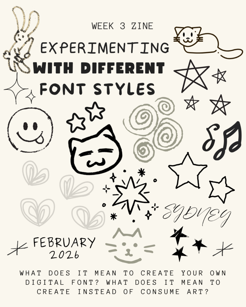
Image Credit: Created on Canva
This helped me in breaking out of the templated grid structure that I felt stuck in last week and moving away from what was making my work feel too digitally generated. By intentionally exploring different fonts and typography and figuring out how to add and create my own drawings and other aspects, I’ve started to feel more confident in my ability to bring an authentic human aspect to my online digital zine.
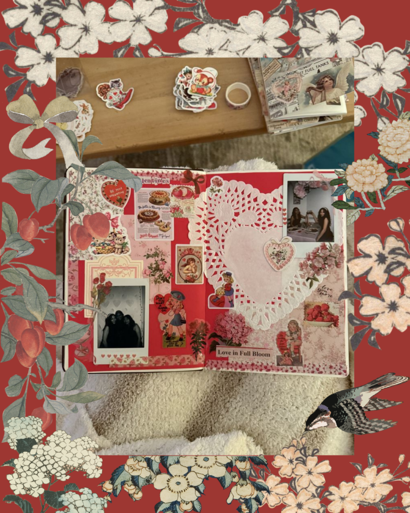
Image Credit: Created on Canva
Reflection
To connect back to the First Peoples Principles of Learning (FPPL), I’ve been thinking a lot this week about the principle that learning involves patience and time. In my Week 1 post, I talked about my reliance on templates in digital design. This week, the patience in learning for me wasn’t just about the physical process of drawing but also the patience to sit with a “bad” drawing/design until I figured out how to use online tools to match my vision. In terms of my Zone of Proximal Development (ZPD), I’d say that I’m moving away from simply “consuming” and using templates to now designing and building my own basic layers and structural design pieces. I’m no longer just looking for a “handwritten font” or the perfect sticker collection; I’m creating the letters and stickers myself while still searching outside of Canva’s templates and discovering better fonts and other online sites that offer a large range and multiple formats of digital artistry.
Next Week
Now that I feel like I’ve established a foundation and a strong starting point for my digital creativity, I think that my next challenge will be multimedia integration. I want to see how I can include a “scanned” tangible scrapbook piece, like a real-life coffee sleeve or a movie ticket, into the digital zine using my phone’s scanner software to see if that further connects the space between the physical and the digital.
Week Four – Pinterest Inspiration & Online Transfer
Video Credit: PlusOne® on Vimeo
This week, I wanted to focus more on the deeper creative “why” of my zine’s aesthetic rather than the technical details of using digital tools. My original goal was to see if digital scrapbooking could capture the genuine authenticity of a physical scrapbook/journal, and this week, I feel like I stopped fighting the software and started working with it towards my vision. I spent a significant amount of time this week on Pinterest, Designspiration, Vimeo and other digital online sites for creative inspiration, with the purpose of intentionally seeking inspiration and tangible multimedia inspiration/ideas.

I worked on finding inspiration from online artist sources, and then using that motivation to create in my own way. Designspiration, in particular, was a newly discovered resource for me that had lots of visual zine elements that I liked and experimented with, as I want to find digital artwork from other people that seems meaningful and personal rather than flat and digital.
Photo Credit: Ferdinand-Noel Bacani on Designspiration
Online Inspiration
Video Credit: megjournals on YouTube
As I worked through this week, I kept coming back to creative YouTube videos. I really liked this one in particular because of the creator’s approach to zine-making and how she talked about her own personal conflict between digital and physical authenticity. It was super helpful to watch her zine layering process as she talked the viewer through it.
She explained that she uses pages from an old A-Z gardening book as the base for her zines, which is exactly what I’ve been trying to do with my Pinterest-inspired vintage backgrounds. She also doesn’t start with a blank white page; instead, she starts with a page full of history and text, then uses white acrylic paint to “push back” the areas she doesn’t want or like, which I think is a really cool idea.
The video ends with her talking about how not every zine will be amazing, that some might even be “flops”. I can relate to this, especially in Weeks 1 and 2. But it reminds me that the goal isn’t a perfect product, but rather the creative process and showing up to do the work every week.
Image Credit: Content from Pinterest, Compiled on Canva
First Peoples Principles of Learning (FPPL)
Connecting back to the First Peoples Principles of Learning (FPPL), I’ve been reflecting on the idea that learning ultimately involves patience and time. This week, for me, was more about enjoying and experimenting with the intentional experience of a digital creative search, such as looking through artists’ digital archives, watching zine and scrapbook videos, and actively asking myself, as I look through these materials, why a certain layout may have felt more human while another felt too technical and/or rigid.

Image Credit: School Library Journal
Essentially, this week’s work was less about the online technicalities and more about the mental effort of translating a physical feeling into a digital space.
Image Credit: Created on Pinterest, Compiled on Canva.
Zone of Proximal Development
In terms of my Zone of Proximal Development (ZPD), I’d say that this week I’m moving from “Basic Formatting” towards a more confident “Artistic Composition”. I feel like I’m finally getting over the technicalities, like trying to find specific buttons, formats, templates, and so on, and instead focusing more on how the placement and arrangement of photos on the zine page affects what I’m trying to convey artistically.
I’m also realising that a lot of the authenticity that I’ve been looking for doesn’t actually exist within Canva’s toolkit, but rather it comes from my own willingness to embrace imperfection and my active choice to learn from the online community of creators that I’ve been interacting with and discovering online.

Image Credit: Samuel Ubinas on Designspiration
Next Week
I’m still working towards and committed to my goal of multimedia integration. To truly test the boundaries of this inquiry, I want to scan an actual, tangible thing from my week, such as a coffee sleeve, movie ticket, or fruit sticker, and turn it into a zine element that can be used throughout my own workspace. My challenge for next week is to figure out how I can work with these actual physical items alongside digital creation while maintaining a seamless transition.

Image Credit: Brian Danaher on Designspiration
Week Five – Scanning & Scrapbooking
Last week, I set a goal for myself to work on including more physical material and just to improve overall multimedia integration. I wanted to see if I could scan the physical “clutter” from my scrapbook pages and journals and include it in my ongoing digital zine scrapbook.
I started by exploring digital designs and stickers to get an idea of what I could scan and what makes a piece of material a high-resolution PNG vs what may not show up as well digitally. I used my phone’s scanning app and struggled at first to get a proper scan that didn’t include shadows and uneven edges of real-life objects. I scanned a coffee sleeve and a fruit sticker, but I didn’t like how it appeared and couldn’t fix it in Canva, so I switched to scanning my own designs instead and experimented with them.
Image Credit: Sticker Zine Collection
I felt better by focusing on scanning one part of my journal page rather than trying to recreate an entire digital page based on one physical journal.
I also thought about how digital scrapbooking can be more difficult because it feels more “limitless”, which can make it harder to both start and continue.
In a physical journal, you are much more limited by the size of the paper, and I find it is often easier creatively to pick up where I left off when the work is right in front of me on paper.
Image Credit: My Journal
For inspiration this week, r/zines on Reddit has given me a few tools through this online community where creators discuss their own experiences in transitioning to digital art, specifically PDF formats, as a way to make their work more accessible to a wider audience without relying on expensive, paid services. I appreciated finding a common goal in this Reddit group when it came to using digital tools not just for design, but also for online creation, and mainly as a medium for accessible digital distribution. It was encouraging to read posts about other people who have had the same challenges and questions as me about textures and formats, physical to digital platforms, fonts, layering, scanning, etc.
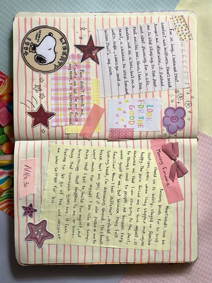
I also tried experimenting with scanning the entirety of one of my written journal pages to analyse how layering can be edited and modified digitally. I like trying to recreate a mix of handwritten reflections, washi tape, and overlapping ephemera like the “Look for the Good” hand writing and Snoopy drawing on the physical journal page.
Image Credit: One of my Journal Pages, with edits through Pinterest and Canva.
Documenting my physical scrapbooking process this week felt like an exercise in mindfulness. I spent a lot of time surrounded by the chaos of my workspace; as you can see in the photo, it’s usually a mess of sticker sheets, Polaroids/printed photos, magazine cutouts, ticket stubs, and as many other pieces from my life that I’ve picked up and gathered over time.

Image Credit: Myself
My goal was to focus directly on capturing these materials/items by scanning them with my phone. With this in mind, I’ve noticed that I’m starting to feel more digitally strong in creative content/material when I can focus on scanning and including previously created specific parts of my journal pages that I like, rather than trying to digitally recreate an entire page from scratch.
By digitising specific journal pages, I’m working towards meeting my initial goal of learning how to preserve the real ‘human quality’ of digitised art while still learning and exploring the flexibility of using a digital zine layout.
This process isn’t just about making a copy of my journal but about recreating what it would mean to me and/or look like in an online space.
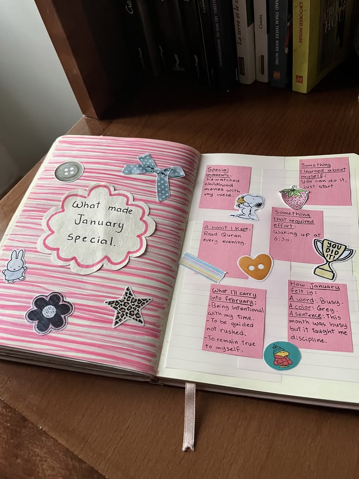
Image Credit: My Journal, Inspiration from Pinterest
Video Credit: Kel Belter via YouTube
I also found this YouTube video tutorial to be an inspiring turning point in my own creative process, particularly when the creator talked about simplifying the move from scattered ideas to a more structured physical item. When I have a big idea/vision of how I want a certain design to look, I’ve realized that for me, it’s more beneficial to start with a “low pressure” approach, like using a single sheet of paper to create a mini-zine page to actually map out my ideas rather than just starting without any clear direction. It’s important to focus on the suggestion of having a more manageable creative space, as the video talked about, as well as taking advice from the video and applying what it means to my own creative process.
By embracing the video’s advice to use tools that can’t be erased, such as permanent markers, to actually show my brain process, I’m able to move away from a perfectionist mindset and towards accepting imperfections as part of the zine’s authentic character, both in person and in a digital format, where the need to edit to perfection is typically the strongest. Also, the suggestion to look through my phone’s camera roll for theme ideas inspired me to stop overthinking and start creating, illustrating, and representing the life I already document on a daily basis, providing the perfect connection/transition I’ve been searching to find between my digital archives and paper journal.
Image Credit: My own Journal, Pinterest
Reflection & Academic Connection
I would say that this week connected well with the First Peoples Principles of Learning (FPPL) principle that learning requires patience and time. I spent hours just figuring out how to make a scanned sticker or doodle look like it “belongs” on a digital page rather than just being pasted on. It reminded me that the instant nature of digital design isn’t always true, and that often artistic quality requires an understanding of the materials and tools at hand while understanding how to actually use and apply these tools in the creative way I originally intended.
For the Zone of Proximal Development (ZPD), I would say that I’m moving from the “Developing” to the “Expanding” phase. I am no longer just following a tutorial on how to use an online tool, but I am now exploring and experimenting with tools like the “Edit Image” settings and digital scanning options, as well as exporting/uploading to adjust contrast and transparency on my own scans to match the specific vision I see in my head.
Next Week
My goal for next week is to expand my digital library by making custom stickers out of the street art I see around the city. I’ve already started documenting these vibrant, different textures with my phone and whatever stands out to me as I go on daily walks, and so my goal for next week is to work on focusing on isolating those designs and incorporating them into my zine as a way to connect my personal journaling with the world around me.
Image Credit: Taken by iPhone in Fernwood, Victoria BC.

Image Credit: Taken by iPhone in Downtown Victoria, BC.
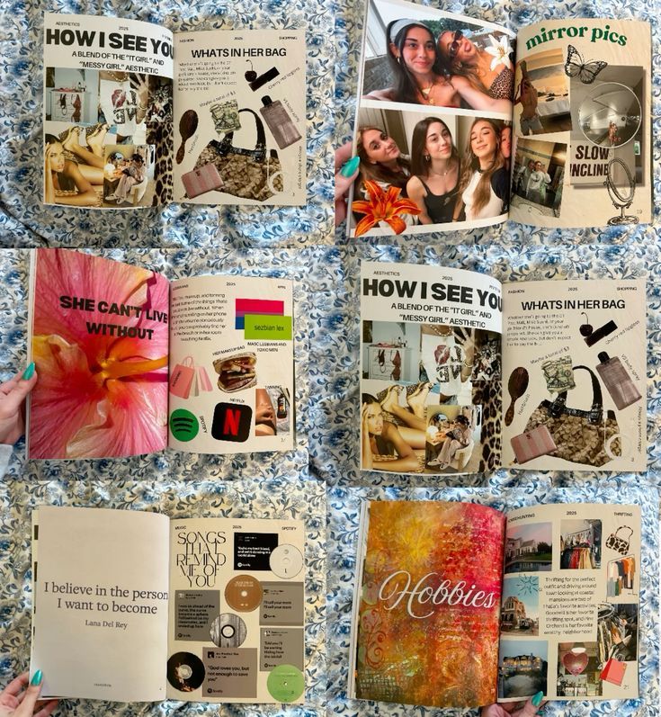
Week Six – Canva Zine Redesign
This week was pretty intensive. I looked at everything I’ve created over the last two months and realized it didn’t look like one single zine but more of a scrapbook collage of all different journal pages and zines put together. To work on fixing that, I spent this week redesigning the entire zine from the ground up to make sure the “hybrid” feel was more consistent and included my paper journals throughout as much as possible.

Image Credit: My Zine Design via Canva
Redesigning was more than just moving things around; it was also about exploring different design components, templates, creative methods and various textures. I’ve been exploring with opacity and layering in Canva to make digital elements look like they’ve been glued down, and also adding grain or tape filters to make it appear more scrapbook-like. I’m also leaning into my own handwriting more.
A huge part of my process this week was going back to my physical journals. I took photos of the new pages I’ve been working on to see why I liked them and what parts I wanted to include digitally. I added subtle digital drop shadows to my “stickers” and intentionally am trying my best to make the digital version actually feel like a zine that’s creative and not typical.

Image Credit: My Zine Design via Canva
Physical vs. Digital
The Zine Library was a super helpful resource for me this week.
It’s a fully comprehensive, digital archive/collection of independent publications that showed me how other creators manage their own artistic and creative chaos without losing the composition and professional aspect. It pushed me to be more intentional with white space left over, even when a page is filled with stickers, ephemera and heavy textures. I’m learning that the crossover from physical to digital isn’t just about filling every inch of the page but also about knowing when to let the base layer come forward so that the overall zine theme stays coherent and consistent with what the overall look/message that I’m going for.
Video Credit: How to Make a Zine (Vimeo) by Nicki Sabalu via The Zine Library
I also spent time on the Broken Pencil site. Even though the magazine’s print run is now entirely online, the digital archive of over 10,000 zine reviews and creative formats is still a valuable resource for anyone looking to keep and maintain their own DIY/scrapbook aesthetic in the midst of going digital. It helped me figure out how to stick to a consistent, unified colour palette while also making the digital pages feel like they were taken directly from my own independent journal page.

Image Credit: Broken Pencil
I also want to include ZineWiki, because it really does seem to be the ‘Wikipedia’ of the zine world/community. It’s been a great resource to cross-reference different genres and styles to see how various different subcultures choose to create and design their own zine layouts, which in turn has helped me refine/edit the local, personal art aesthetic I’m building for my own zine.

Image Credit: Zine Wiki, Zine Library
First Peoples Principles of Learning (FPPL)
Connecting back to the FPPL, I’ve been focusing on the principle that learning is holistic, reflexive, reflective, experiential, and relational. This week’s redesign focused heavily on connectivity. I realized that my zine couldn’t just be a collection of isolated digital files and photos and scans, but it needed more of a holistic composition and human aspect in order for it to feel like a truly cohesive piece of art.
By going back to my physical scrapbooks and taking pictures of my progress, I was being reflexive by letting my hands-on experience with actual paper and glue inform and guide my digital choices. It’s also about a sense of place, like by including local Victoria street art, the layout feels grounded in my actual community rather than just being a generic template. It shows that learning isn’t just about the final result but also about how all these different parts of my life and creative process connect and relate to one another.

Image Credit: My Zine via Canva
Zone of Proximal Development (ZPD)
Reflecting on where I am in my Zone of Proximal Development (ZPD) this week, I would say that I’ve reached a point of independent mastery with Canva. In the beginning, I relied heavily on scaffolding, like tutorial and instructional videos along with pre-made templates, to learn how to use and navigate the interface and become more familiar with the platform itself.
This week, that external support has faded away as I’ve moved out of the “beginner” phase. I am no longer focused on the mechanics of the software; instead, I’m working from a place where I can focus on high-level compositional choices and having fun with the zine and materials I currently have up until this point.

Image Credit: My Zine via Canva
Next Week & Reflection
With all my physical journal pages finally scanned and uploaded, I’m at the part of my inquiry project where the majority of the “heavy lifting” is done, and I’m moving on to one the most rewarding parts of this inquiry: the finishing pieces/layers/corrections,edits, etc. I am now deeply immersed in the Canva workspace, actively navigating the finer details, like improving, adding, and making my design as strong and comprehensive as I believe it can be.
This isn’t just about finishing an assignment; it’s about refining a comprehensive portfolio that I’m genuinely proud of. I’m enjoying exploring and experimenting with finalised versions of various layers and elements, like adding digital washi tape over paper textures, adjusting the transparency of my uploads of local street art, and modifying photo scans to see how they work with my handwritten reflections. These final few steps are my last input before my zine makes its official debut as a polished, authentic representation of my learning journey and educational experience within this inquiry project.
The Final Reflection on My Digital Hybrid Zine
When I started this project in January, I wanted to make my art more accessible through a digital format, but I was worried that moving my journaling and scrapbooking to a screen would feel too templated or artificial. I’ve always been drawn to the tactile in art and creative expression, and so my main question guiding this inquiry project for me was about focusing on if a digital space could ever actually hold that same human weight and have the same effect. Looking at the final pages of my zine, I realized that the “digital” part wasn’t the difficulty, but it was just a new kind of creative art skill that I gained/learned.
Did I enjoy this as much as I expected? Honestly, more. There is a specific kind of creative experiment in navigating the connection between digital and tangible types of work, and I found that this inquiry forced me to stop looking at Canva as a professional design tool and to start treating it like more of an interactive art form. The highlight for me wasn’t finishing a “perfect” page; it was moreso the moment when I finally figured out how to make a scanned coffee sleeve look like it was actually taped onto the page and hot o scan my own scrapbook pages into a digital format that looks real and genuine instead of static or templated. It was that connection between the physical world I wanted to show but express through the digital world I learnt to interact with on both a creative and personal level.
The Final Product
“I wanted to see if I could take my own prints, drawings, stickers, journal and scrapbook pages and digitize them without losing the heart of my art. It wasn’t just about making a copy; it was about learning and understanding how to turn a feeling into a digital format.” (From Page 29 of my Zine)
Link to my Digital Zine / Scrapbook :)!


Tools / Resources
When I reflect honestly, I would say that the most helpful tools and resources that I discovered weren’t just the software and technologies, but the communities that taught me how to use it.
- Canva for Education: Once I moved past the preset templates and started using the Draw tool and custom drop shadows and stickers texture/contrast design, the pages started to look more like the scrapbook idea i visualized in my head and like my own scrapbook pages.
- The Graphics Fairy: This was basically essential for me in finding the vintage, grainy textures and tape/stickers i used to keep pages from looking too technical.
- The Zine Library: Exploring and browing through this digital archive helped me realize that my artistic creation and interpretive chaos didn’t need to be hidden or moved away from the digital screen, but it just needed a bit of structural intention to keep it from feeling like a random collection of page scans.
- r/zines: Deep-diving into this online community was a massive reality check for me because It reminded me that zines should be messy and that perfection is actually the enemy of authenticity in this medium. Seeing other creators navigate that same analog-to-digital struggle gave me the encouragement i needed to stop over-editing and analysing and just enjoy my own creative process and final product.
Advice to January Me
If I could send a message back to the start of the semester, or to any EDCI 336 student starting their own inquiry, it would be to focus more on the process, not necessarily the final product. In my week three reflection, I looked at Brandon Sanderson’s idea that “art is useless,” and it changed my own perspective and approach to art. Don’t choose a topic because you think it will look good on a resume; choose it because it’s something you’d want to do on a rainy Sunday anyway. If you aren’t failing at least once a week (like my first layouts in Week One), you aren’t actually learning the tool, you’re just following instructions. That’s probbaly my biggest takeaway.
Video Credit: Brandon Sanderson via YouTube
ZPD & FPPL
For me, this inquiry has been a living example of the Zone of Proximal Development (ZPD). I started as a consumer of digital media, and through the PSII Inquiry framework, I moved into the “Expanding” phase where I was finally using the tools to fit my own vision, rather than letting the tools dictate the design for me.
It also brought me back to the First Peoples Principle of Learning that learning involves patience and time. You can’t rush authenticity. It takes time to scan, to layer, and to sit with a design until it feels right.
Final Reflection
Ultimately, for me, this zine has turned into a digital capsule of my actual process this semester as part of my free inquiry project. It’s cluttered, it’s unapologetically star-heavy, and it’s full of the same styles you’d find in my own personal scrapbook journals. I’m very grateful I had the opportunity to experiment with something I genuinely love!